Chipotle Orders and Nutrition Facts
Biography
My name is Timothy Castillo and I am a Junior Computer Science Major attending the University of San Francisco. You can get the opportunity to catch me on tacastillo.github.io or tacastillo@dons.usfca.edu
Original Data Set
The original Chipotle Data Set was a collection of 1,800 online Chipotle orders from two Chipotle stores in different parts of the United States(Washington DC and East Lansing, Michigan). All orders were collected between July 2012 and December 2012. This initial data set came to fruition from a NYTimes Upshot article on Chipotle and the initial orders were found on the Upshot's Github profile.
After realizing that the data set didn't have enough columns to create three complex visualizations, I expanded my search and found a corresponding data set from a user named Ethan Lusterman that contained supplemental nutritional information on chipotle's menu items.
The original orders data set had 4623 rows and 5 columns, which were
- order_id
- quantity
- item_name
- choice_description
- item_price
The supplemental nutritional facts data set had 50 rows and 14 columns, including
- Item Name
- Calories
- Total Fat (g)
- Saturated Fat (g)
- Cholesterol (mg)
- Sodium (mg)
- Carbohydrates (g)
- Fiber (g)
- Sugars (g)
- Protein (g)
- Vitamin A (% Daily Value)
- Vitamin C (% Daily Value)
- Calcium (g)
- Iron (g)
Data Processing
When I started this project, I knew my first visualization would involve the meats used and the mediums the meat was found in (Burrito, Taco, Bowl, Salad). To prepare for this, I processed the data to add two more columns to the data set: Meat and Medium. I iterated through the data set, checked if the item_name contained the meat or medium I was looking for, mapped it back to the object, and wrote it back to the file. One nuance that I had to factor in is that sometimes a Bowl is referred to as "Burrito Bowl", so I made sure to map burritos first and then bowls, so when it read the bowl part, it would overwrite that the medium was previously listed as a burrito. To do all this pre-processing, I wrote a Node.js script to allow writing to files and used the tsv module to read in the tsv and convert it to a csv. I kept all the columns from the main and supplemental data set, however I did omit the sides and inclusions of the menu items (ie. adding cheese, lettuce, etc.) as they provided minimal nutritional value and were already including in the cost.
Motivation
I chose this data set because I wanted to pick something that isn't as commonly visualized and we haven't seen lately in class but we interact with on a daily/weekly basis. I am also passionate about nutrition (I used to be a Kinesiology major) and finding the convergences between nutrition and computer science is rare and far between. Chipotle's orders looked like a fun data set with lots of potential to pull away from that was nutrition-related. What I hoped to learn from the these visualizations was popularity of menu items and any correlations between the nutritional value and cost of items.
Visualizations
I created three visualizations that work around the data sets. The bar chart focuses on the orders made, the parallel coordinates focuses on the nutritional information of the menu items and the scatterplot merges both data sets together.
 Bar Chart
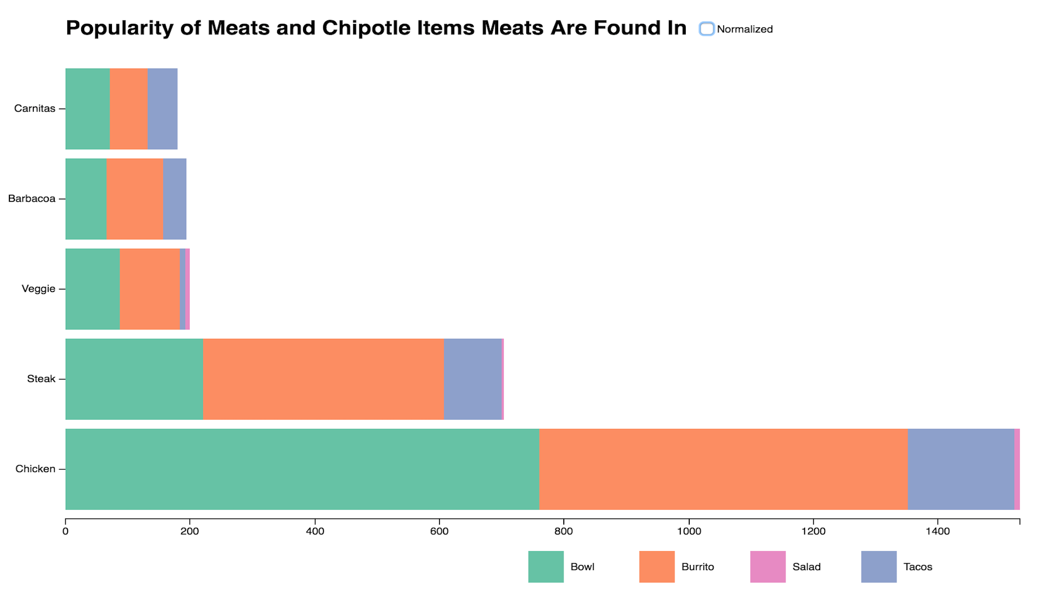
A stacked bar chart where the Y axis is every type of meat at Chipotle, X axis is the orders of each type of meat, and the stacks are how many of each way you can order meat, with tooltips and a checkbox to turn on and off normalization.
 Parallel Coordinates
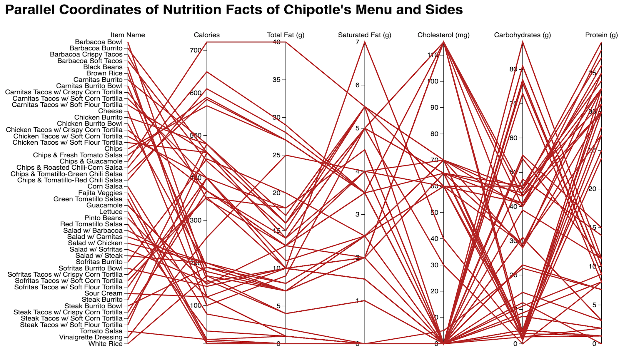
A parallel coordinates graph that maps important macromolecules and nutrients for all 49 Chipotle items and sides. Hoverover interactivity brushes and brings forward that specific line.
 Zoomable Scatterplot
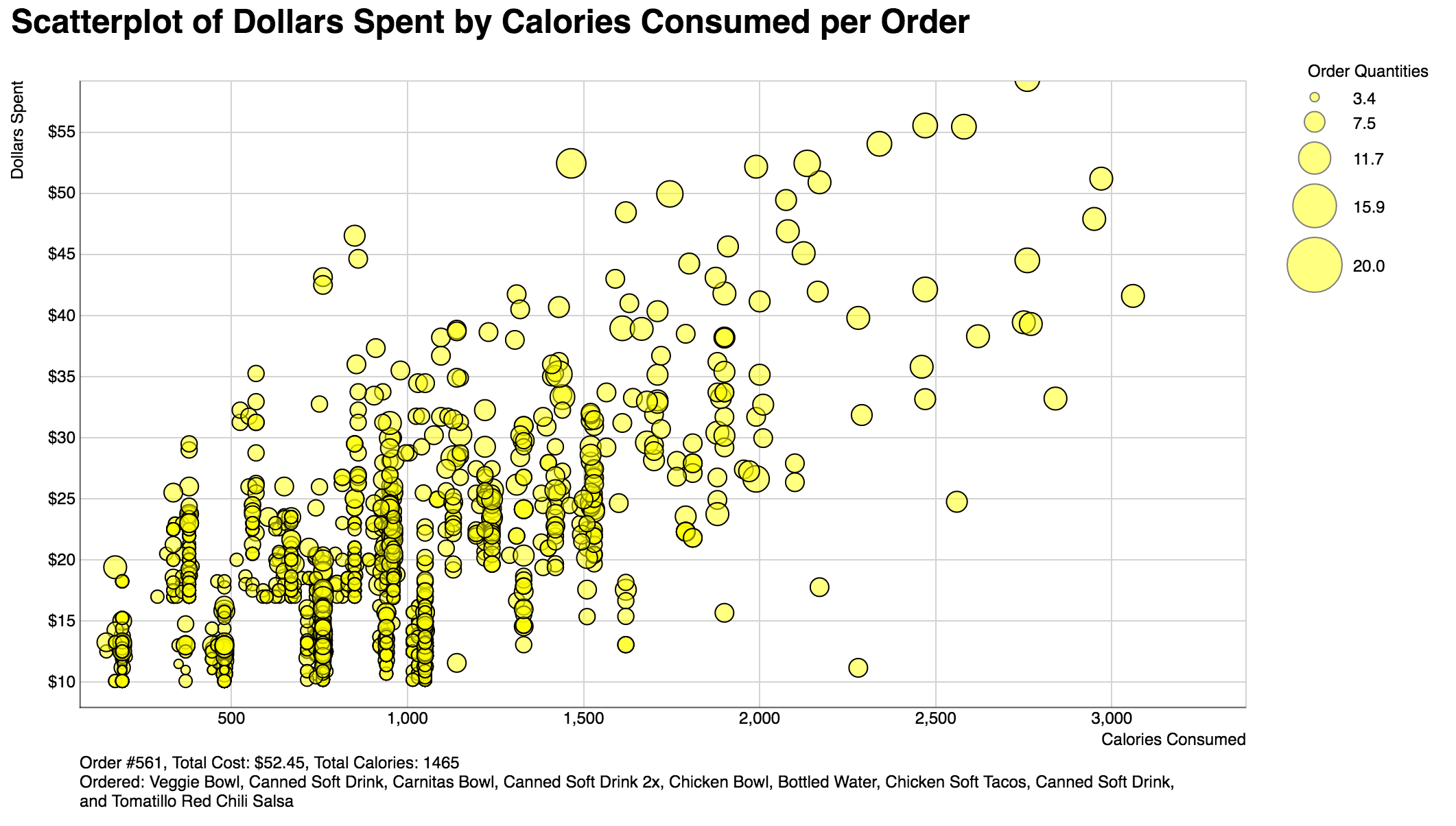
A scatterplot of how much money is spent per order and how many calories that order entails. Radius of circle is based on how many items were in the order. Due to the density of the points, panning and zooming has been enabled to zoom and brush into the denser clusters.
Findings
Many interesting findings were produced from the visualizations.
Bar Chart
The simplest and most apparent finding produced is that Chicken is blatantly the most popular meat, getting ordered almost as much as all the other meats combined. When normalized, many more findings can be explored. An outlier produced is that Chicken is the only meat where customers are more likely to order bowls than they are to order burritos. The probability that a customer ordered Veggie Fajitas is much higher if they were to have ordered a salad, which is an odd redundancy. Trailing behind Veggie Fajitas, Chicken Salads are also reasonably popular.
Parallel Coordinates
Up front, the worst possible item on the menu for anyone and their arteries is Chips and Guacomole, or essentially just chips in general. An interesting cluster that I was able to conclude is that the medium of food (burrito, salads, tacos, bowls) has more leverage over the nutritional value of the food over the actual portions and amount of meat given. Chicken is indeed the highest in cholesterol by a significant margin, however what isn't mentioned in the data set is that Chicken is high in good cholesterols in comparison to pork and beef. And important health fact to take note of is that Saturated Fats are bad for you, so maintaining a solid ratio of Unsaturated to Saturated Fats is important, downward trends between the Total Fats and Saturated Fats is good for you. Therefore it is noted that Barbacoa is relatively unhealthy in this sense, as its line progresses upwards between Total Fats and Saturated Fats.
Scatterplot
A rule that I generally follow for managing money and making sure I get enough calories in a day is to try and eat so that you spend less than a $1 for every 100 calories you consume. Visualizing this rule on to the scatter plot, it was easy to deduce that very few actual orders at Chipotle follow this rule. If a line were to be drawn linearly along the scatter plot, it would be apparent that less than 1/3 of all orders follow this rule, despite the high caloric and nutritional value of Chipotle orders. Looking at the massive clusters of similar orders towards lower end of the graph, it can be observed that the trend is more likely that the average Chipotle customer spends a dollar for every 175-200 calories. An interesting detail is that even though there are clusters, they are not too heavily packed and there is actually a wide display of divergence in orders once zoomed and brushed into the under $100 bracket.